
What to expect with letterpress
Letterpress printing is an extremely hands-on process and that will be evident in your prints! Everything from the trimming of your paper, registration measurement and ink mixing is done by hand and by eye, with manual machines. We love it for this reason, but if you’re looking for computer-perfect quality this process may not be for you. Here are some things to keep in mind:
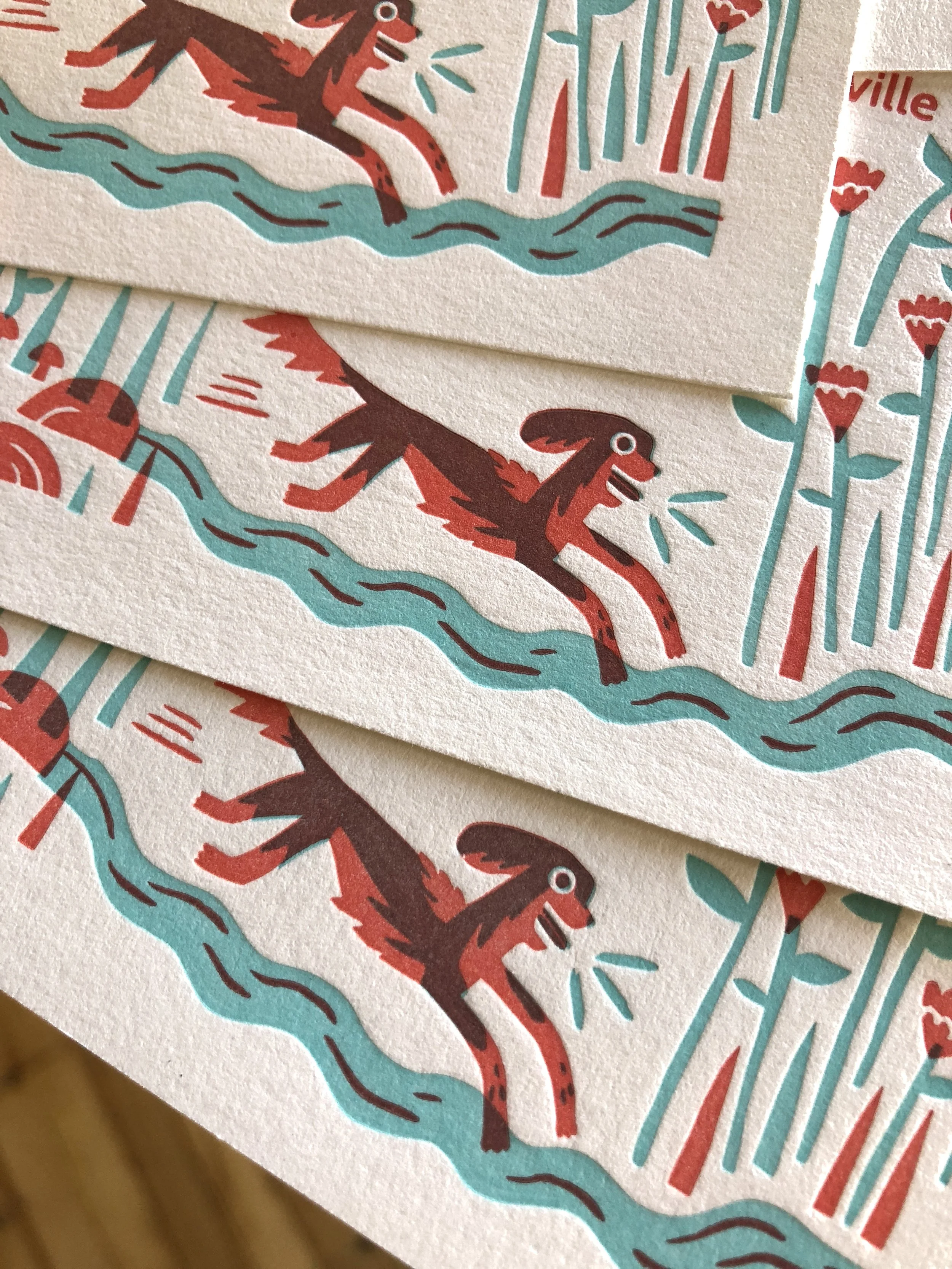
Letterpress is ideal for text and line work/imagery, and less suited for larger solid areas of flat colour. The impression (“deboss” texture) and ink density will be more consistent for a smaller printed area, while a larger flood of colour will appear more flat and with an increased mottled or “salty” ink density. This can vary according to both the colour and the chosen paper stock: darker colours and matte textured cotton paper will result in the most salty appearance, while lighter colours and smoother paper will provide a more even and consistent appearing ink density. We’re happy to provide guidance for best practices if you’re unsure!
Each print is fed into the press by hand. Ink is applied manually and monitored by eye, so some variation of ink density throughout the run is expected.
Our colours are mixed by hand referencing the Pantone Colour Formula Guide. Although we aim to get a great colour match each time, some colour variation is possible.
Our presses print 1 colour at a time! This means we cannot reproduce photographic or full colour imagery, and any shading must be done with solid shapes (ie. dot matrix, stippling, cross-hatching, etc.)
Two sided printing can be tricky with letterpress, as the impression will push through slightly to the other side, affecting the texture on the back. We recommend using a double thick paper stock to help minimize this. It’s even better if the printed areas in your design don’t line up from front to back.
The largest sheet size we can print is 14.75 x 20”. Maximum printable area using plates is 9 x 12” per colour, and 14 x 18” using type or blocks.

Printing terminology

Solid ink coverage
Variance from print to print, a "salty" or mottled ink density, and little to no deboss occurs with large solid areas of flat colour.

Blind impression
Printing with little to no ink gives a beautifully subtle texture-only effect.
overprinting
Our inks are translucent, so two layered colours can result in a third! (3 colours for the price of 2!)

Split fountain
When the press is inked with multiple colours that blend together, also known as a "rainbow roll".

Pricing
Because each project is unique, we quote per job and don’t have a set price list. Cost and process varies according to design, print size, type of paper, and number of printed colours.
Our presses print 1 colour at a time, so multiple colours can affect the cost significantly as additional materials, press set-ups, ink mixing and increased labour are required for each added colour.
If you have a budget in mind, let us know and we’ll be happy to suggest best practices in order to stay within it!
Minimums
Although we don’t technically have minimums, our press set-up and materials fees mean a smaller quantity will result in a higher price per piece. A typical run for business cards in our studio is 100-500 qty, and at least 50 qty for wedding stationery and other projects.
Turnaround
If you’re supplying a design, our printing turnaround is about two weeks from design approval and/or deposit payment.
If we are doing design work for you, we recommend allowing at least 1 month for semi-custom wedding stationery, 2 months for full custom wedding stationery, and 3-6 weeks for other projects.
This can vary according to our current availability so don’t hesitate to reach out and ask!
